Thursday, July 25, 2013

Going Into August

  Oh why does the summer seem to fly by faster than any other season???? But finally my beach vacation is quickly approaching so I will be taking a little break from blogging after this post. Here's a little variety of projects I recently completed.

  First up is a bridal shower card I created for a friend. Her colors are black, white and silver.

   Products: textured white card stock, silver card stock (The paper Cut); white flower embellishments (Recollections); black paper flowers (Michael's); black crochet lace (vintage find); Versafine Onyx Black ink (Tsukineko); clear UM stamp-Mega Mixed Messages set (Papertrey Ink); Grand Calibur die cut machine and Impressabilities Flourish Embossing Plate (Spellbinders); pearl sticker (Queen & Co.).

  I'm also sharing my August calendar spread for Kate Crane's 2013 Calendar Challenge:


  Brushed Americana baby Blue and Golden fluid Acrylic in Cerulean Blue over top section of pages. I then added dots of acrylic paints (Americana Moon Yellow and Raw Sienna;  My Studio Dark Yellow; Folk Art Fresh Foliage) across the lower half of the pages and used a credit card to scrape and move the paints around. The credit card edge was used with Raw Sienna to create "reeds". I had seen something similar done quite awhile ago on Jill Berry's blog and loved that the colors reminded me of a beach scene.


 I prepared the pages using images and words from ARTchix Studio and numbers and lettering using several stamp sets.

 This is just a simple little journal page I did prompted by one of the Summer of Color 2013 color combos (aqua and pale yellow) which weren't chosen. I decided to continue to challenge myself even though this challenge is officially over. We'll see how many I get through :).


   I had this gelli plate print photo of myself (you can read more about some gelli plate print techniques in this post) lying in the stash of papers and they were the right colors so I worked from that. The watercolor journal page was dry brushed with aqua, light yellow and white acrylic paints after gluing down my print. I added some words from an envelope of magazine clippings I have along with a scrap of aqua tissue paper, some leftover aqua vellum stickers (circles), and a butterfly sticker.

  Here's the last journal spread I'm leaving you with:


  For the background I scraped yellow, then orange, then turquoise acrylics over the page allowing each color to dry before adding the next. Did some mark making with a scrap of corrugated cardboard, bottle caps and sequin waste with white acrylic paint.I stamped the red dots using acrylic paint and a stamp from Dylusions Basic Backgrounds set. I had this extra beach photo lying around so I glued it to the page then went over areas of it with some of the background paints to blend it in a bit. Added some spatters of black spray ink along with a piece of Smash Book washi tape. I printed the words over the photo digitally.

  Linking up to Art Journal Every Day, Creative Every Day, Mandarin Orange Monday, 2013 Calendar Challenge, and Paint Party Friday. I'll try and get around to visit as many as I can before packing and leaving. I will have some computer access but am limiting myself drastically during my break in order to soak up as much fun in the sun as I can with my friends!

  See you in August!

       "The ocean stirs the heart, inspires the imagination and brings eternal joy to the soul."  Wyland

Friday, July 19, 2013

Journal Pages and Digital Play

   For those of you experiencing the extreme heat and humidity of summer the last few weeks I hope you are able to cool off a bit whether it be in AC or a pool! Right now (as I'm typing the draft for this posting) it is 1:20PM 95 degrees F with a heat index of 105 degrees F. It wouldn't be so bad if the air was dry and not so humid! And we haven't had any rain for a respite either. So what's a girl to do? Stay inside and make art of course :).

  The word/tag for the month of July in my 52 Weeks of Creative Abundance course is "trust". This is my journal spread and tag:

  For the background I used Stone Gray Staz-On ink and an old script stamp (Love to Stamp) repeatedly over the pages. Gesso and Pineapple acrylic paint (Americana) was dry brushed over that. Quinacridone Magenta (Liquitex) was then lightly brushed on two opposite corners and Stone gray ink was sponged through stars sequin waste on the other two edges. The tag was already colored-leftover from mopping up color from other projects. Sewed edges, added letter and butterfly stickers and ribbon. The collage card and bird are from ARTchix Studio. I typed up a sentence Christi had written in our weekly lesson and once glued in place I outlined it with a black pen. I circled the word "trust' with Buttercup Liquid Pearls (Ranger).

  This is the inside back cover of a different journal I finished (well, almost. There are still a few pages unfinished and when the mood strikes me I'll get to them). I love having a bunch of different journals in different sizes to play in!

  Painted a frame around the pg with a teal acrylic paint and filled in with orange. Glued part of an envelope with postage (sent to me by family in France-I save them all). Added some gesso around portions to blend it in the page. Added two found ticket stubs and magazine image. Words stamped with two alphabet sets and Jet Black Staz-On ink. 

 I mentioned in my previous post  about how Lori (Mandarin Orange Monday challenge host) had me so inspired with all her fun digital manipulations for the challenge each week. I began to tread lightly last week and this week I took a bit more time to explore more possibilities with PSE and a simple photo. This sis SO much fun!!!

 Took this photo of my gorgeous blooming hydrangea bush which is full of blooms this year! I think I finally figured out the pruning thing :).


Digital manipulation 1. I used an orange fill layer first then under the layer tab at right (I have PSE 10) I chose "lighten" and changed the opacity to 85%. Under the "Effects" tab( top right) I chose "brushstrokes". Changed the opacity to 39%. Back to effects tab and added "glowing edges".

Digital manipulation 2:

 For this one I began with the orange fill layer. Added  "lighten" from layers tab and changed opacity to 85%. Under effects tab I chose "stained glass". I am loving this and there is SO much more to play around with!

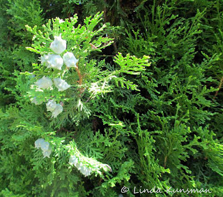
 Photo close up of one of our yew trees:


 Added digital manipulation:


  I used a vibrant orange/red fill layer. Under effects tab I chose "find edges". Under layer tab I chose "difference" and kept the opacity at 100%. Awesome!!!

  One more. This is a photo of a cemetery building I took in France:

 I changed this photo to black and white.

 And this is more orange play:

   Began with orange fill layer. In the effects tab I went to "brushstrokes" and chose "ink outlines". From there I went into "layers" and chose "multiply".  Now for all you digital art savvy folks I know I'm still in kindergarten, but color me happy!  

  Linking up  to Art Journal Every Day ( I hear Julie Fei Fan Balzer, the host, is going to have  lots of new stencils to premier at the next CHA :), Creative Every Day, Glue It Tuesday, Mandarin Orange MondayPaint Party Friday, Show and Tell Saturday. I'll be looking for you at one or more of these places.

  "Trust yourself. Create the kind of self that you will be happy to live with all your life. Make the most of yourself by fanning the tiny, inner sparks of possibility into flames of achievement." Golda Meir


Monday, July 15, 2013

Explore

   Thanks to all for your comments last week and for your concerns about my finger. It's healing very well and I'll be down to just a bandaid tomorrow. You should see how both my hubby and son looked at me though when I got out the knives to prep for dinner yesterday :).

  First I want to share two photos I played around with in Photoshop for the Mandarin Orange Monday challenge. Lori shares her really fab PS photos and I wanted to learn how to play a bit too. My son was over and I had him explain a few things. This is my first play with effects, layers and opacity and oh my-the possibilities are endless! I squealed with delight like a child who got an extra scoop of her favorite ice cream!! (Son was just rolling his eyes).

Original photo:


 First PS play changing to "cut out" effect, changing color to orange, using the "multiply" layer and playing with opacity:


  And here's the second one I did continuing with the one above, adding another layer(not sure what it was though-I need to write these things all down!):

I really like this one! Thank you for your inspirational photos Lori-you gave me a jump start into something new! Linking this to Mandarin Orange Monday.

 Inspiration Monday's challenge this week is about birthdays so besides a card I made I want to share two vintage cards I thought were adorable. I was given several scrapbooks filled with cards someone had taped to the pages for various occasions over several years.They were going to be tossed-can you imagine???


 She's holding an actual little powder puff. This next card is also a pop up:


   Here is a birthday card I made (4 1/4" x 5 1/2") :


  Products Used: white and black card stock; patterned paper (KI Memories, Inc.); stiff green felt (Hobby Lobby); Jet Black, Forest Green Staz-On ink (Tsukineko); clear UM stamp -Mega Mixed Messages (Papertrey Ink); Grand Calibur die cut machine and Foliage dies (Spellbinders).

  The theme for this week's Simon Says Stamp and Show Challenge is "Good To Be Green". I t can be about the color or upcycling so I'm linking the above card and the next two projects for it also.

  Another card:


  Products Used: kraft note card (Canvas Corp); patterned paper scrap; striped washi tape (Gauche Alchemy); die cut tag (Colorbok); wander sticker (Design Originals); epoxy sticker(source unknown); Vintage Photo Distress ink (Ranger).  It's not just about cards-you should see all the creative inspiration on their blog!!!

 I'm also linking this last project for the SSS&S challenge but I made it primarily for the last :( Summer of Color Challenge at Twinkle,Twinkle. Thank you Kristin for a fabulous time and for hosting!! The last color combo voted in was Sepia and Sage. I chose to make a small canvas:

  I started by gluing  a napkin onto a 3" x 3" canvas . I then added a bit of upcycled dryer sheet to the lower left corner then added the image - Sand and Sea Squares collage sheet (Retro Café Art) on top. Typed and trimmed "sing", sponged with Vintage Photo distress Ink (Ranger) and glued on along with two paper flowers (Prima) and pearl stickers (Queen & Co.).

 Oh, I'm also linking to Artsyville's Glue It Tuesday hosted by Aimee. She creates such colorful, happy art and of course I LOVE it!!

  Hope you're taking time for some art this week. See you Friday at the party (Paint Party Friday)!

" To love what you do and feel that it matters- how could anything be more fun?"  Katharine Graham


Thursday, July 11, 2013

A Really RED Week

   I was very happy to find one of my favorite colors in the Summer Of Color Challenge this week so I got to work on two projects that I luckily completed Mon. That was the same day more red came into my life quite unexpectedly. All I wanted to do was slice and chop  my last bit ( a tomato) for tacos for dinner. And then that darned Cutco knife decided to take a bit of my finger with it-ugh!!! Amazing how much a small thing can bleed. So I held on tight with a paper towel and had hubby drive me to the drugstore to get some things to wrap it up. I'd worked in the healthcare field many years so of course I figured I could take care of it myself. It started to look that way anyway. The night went OK, no more bleeding under the wrap and luckily my finger didn't swell much (my wedding ring finger with the rings still on. Next AM I had to soak my finger to get the last bandaid off. Once that happened the blood began gushing. I thought poor hubby was going to pass out so I sent him away and called on my Mom to take me right to the urgent care center. ( I was supposed to be picking her up and taking her out for the day for her birthday). It took two special wrappings and attempts to stop the bleeding but finally I was able to leave with this:


 The smiley face was done in blood with a tiny brush I had in my purse.   NOT! I used a permanent marker:) Turns out my doc had sliced a bit off one of her fingers one time so she understood. Said I was lucky I didn't need my rings cut away nor did I have to have skin grafting done (so far). And it IS on my left hand and NOT my middle finger. So, it could always have been worse. Thurs. AM had to go back for a dressing change. Took awhile to soak all the dressings off but it finally came loose and thankfully it's beg. to heal. All I need to do is continue cleaning and redressing it thru Sun. then I can just use a bandaid. Whew.

  And so, for the art part...

  Still thinking of the Toulouse Lautrec exhibit I mentioned seeing in this post. Swirled some red and yellow paints ((Kristin's Summer Of Color challenge colors this week are Candy Apple Red and Yellow) on the page then added some ephemera I had in one of my stash boxes. Sentiment stamp is UM from Stampland. 

  An this is my second project for the color theme:

  This is a wood based house 2 1/2" x 4".   Products used: house shape (Michael's); red acrylic paint (Golden's); vintage image (ARTchix Studio); bird sticker (Paper House); yellow ribbon (QVC); paper flower (Recollections); red rhinestone; black pen (Signo uni-ball); photo holders and black wire (JoAnne's); dotted ribbon (Michael's).

  I'm linking these up to Twinkle Twinkle's Summer of Color, Art Journal Every Day, Inspiration Avenue (theme is words), Glue It Tuesday at Artsyville, and Paint Party Friday.

  One more thing using the color red :) A few weeks ago I read  this post by Jane LaFazio about having your blog published into a book. She shared some of her wonderful pages. I was intrigued and checked out the site she used Blog2Print. And I did it! Easy peasy! You can pick your cover, photo for cover and back cover, title, format photo size and then they do the rest. You can preview it first and if you don't like something such as the cover or photo sizes you can edit and redo before paying for the final print. Now mind you, it can get expensive but I figured mine would be reasonable since I wanted to print my first year and I only posted once or twice a week. I even got 15% off and I am THRILLED with my book! Thought I'd share a few pages:

Front cover:

 I wasn't concerned about a pristine photo. This is a journal page I actually edited and use as one of my business cards.

 Back cover:

First Post page:


More page samples:


And I was compelled to write this dedication :


It's why I decided to do this and the first year was very special to me :) Oh-my book size is 8 1/2" x 11" and 133 pgs.

Will be in touch soon. Have a beautiful weekend!

                                     "As you walk your way through life,
                                        Let this ever be your goal,
                                       Keep your eye upon the doughnut
                                        And not upon the hole."     Anonymous

Thursday, July 4, 2013

Artful This And That

   We've been having such heat,humidity and rain that I've been able to get more projects completed than I thought I would this time of year. It's invigorating to be challenged by new things...like Kristin's Summer of Color challenge!  We're at week 4 and the color combo voted in for this week is charcoal grey and pale pink. Wasn't so sure about where I'd go with it at first but I ended up getting two projects done :).


  This is in my watercolor journal. I brushed and painted a light coat of Americana Pink and Warm White acrylics on the page. I added the circles with a stencil and Americana Warm Grey and Warm White. Glued the B &W image (Dover) then smudged edges which I lined with a charcoal pencil. I stamped words (Another Stamp Company) and quote (Invoke Arts) using Stone Grey Staz-On ink (Tsukineko). Finished by edging circles with the charcoal pencil and smudging with my finger.

  The second project I made is a card for my Mom for her birthday next week.

  Products Used: white card stock; patterned paper (Stampington & Co.); pink paper flowers (Paper Studio); grey paper flowers (Michael's; pink rayon ribbon (Michael's); white paper ribbon (K & Company); pink organza ribbon (Hobby Lobby); Grand Calibur die cut machine and Lacy Squares die (Spellbinders); clear UM stamps -Mega Mixed Messages (Papertrey Ink); Jet Black Staz-On ink (Tsukineko); corner rounder (Marvy Uchida); pearl stickers (Queen & Co.) Since the theme at Simon Says Stamp and Show is "anything goes" I'm linking up there also.

  Our orange tiger lilies are in full bloom so I couldn't resist taking a few photos for Lori's Mandarin Orange Monday challenge.


 I love their bright color and the fact that these perennials grow  abundantly requiring little to no care :)

 And now for some French inspired fun! My friend Lynnie and I have been making a point to visit local art museums and exhibitions every so often lately and it has been so much fun to have a friend along who knows and appreciates many styles of art! This past week we visited the Allentown Art Museum to see a very special Toulouse- Lautrec exhibit! This museum is one of the first venues outside of Europe to host this collection on loan from the Herakleidon Museum in Athens Greece. Here are some newspaper excerpts and the brochure and newsletter about it (no photographs were allowed) :


 It was fascinating!! Hopefully you can click on the pics for a closer view and read. In addition, Lynnie and I both purchased this book:

 It's a wonderful small book of 176 pages full of facts, art, documents, family photos depicting M. Lautrec's very colorful life! The exhibit will be in town thru Sept. 1st so I'm hoping to go again-this time with hubby in tow since he's been reading the book :) .

 And here's a journal spread inspired by this exhibit:


   These pages were done in an altered board book. I began by adding texture to the edges of the pages with a sea sponge and modeling paste.. Once it dried I added copyright free images, actual stamps, stickers and postcard stickers to the pages. I then painted Lumiere metallic paints in gold, green and sunset pink over and around the pages and images. I used a variety of French rubber stamps and black Staz-On ink to finish.

  What's been inspiring you lately???


  "To the dull mind all nature is leaden. To the enlightened mind the whole world sparkles and burns."
                                                                                                     Ralph Waldo Emerson


Tuesday, July 2, 2013

Tag Art!

  A short and sweet post today to share some tags I created for a few challenges and also for the online course I'm currently taking. I'm linking my tag art to Glue It Tuesday Inspiration Avenue (Red,White,Blue theme), and Simon Says Stamp and Show(anything goes).

  For those of us celebrating Independence Day July 4th let us remember those who are serving, have served, will be serving our country to protect and preserve the land of the free. God bless America. It's also a big travel day for many so please drive safely.

Products Used: tag-Americana (K & Company); vintage image (ARTchix Studio); cream rayon ribbon (Paper Whimsy); star rhinestone stickers (JoAnne's); Vintage Photo Distress Ink (Ranger).


 Products Used: tag-Americana (K &Company); image-cemetery Angels collage sheet (Collage Stuff); rubber stamp-sheet music (All Night Media); Vintage Photo Distress Ink (Ranger); star nail jewels (Dollar Store); asst. fibers.


  For my 52 Weeks of Creative Abundance online class our instructor Christi introduces a new word/theme for the month. She also shares a tag project. "Explore". Christi spoke of taking time to nourish our souls by exploring.  Perhaps there's a little shop in town you pass by but have never taken the time to go in and explore. Perhaps you want to learn something new but have never taken the time to explore taking a class and nourishing your spirit... I actually have been doing just that the last few months in my home town  by visiting local museums with a friend.  For my tag I decided to explore BIG by listing some of the top places I wish to visit some day.

  Glued postcard patterned paper(K & Company) to my journal page. Whitewashed the page. The tag was created using decorative paper, stamps and washi tape. Edges all sponged with Distress Tea Dye ink (Ranger) then glued in place.

  I'll be back Friday to share my Summer of Color project, some art journal  pages, and my visit to a local art museum to see the very special Toulouse Lautrec exhibit. Off to follow le Tour de France on TV for my chair side trip all over France. Tout a l'heure!

"The greatest gifts you can give your children are the roots of responsibility and the wings of independence."
                                                                                                                        Denis Waitley